p2 =ggplot(dataset, aes(x = League, y = Perfect.Seasons.Needed, fill = League)) +geom_boxplot() +labs(title ="Distribution of Perfect Seasons Needed by League",x ="League", y ="Perfect Seasons Needed")ggplotly(p2)
Second Visual
data <-read.csv("C:/Users/adikh/OneDrive/Desktop/Stat/AnkitBorle/Dataset/stat_proj.csv")#Plotting Bar Graphbar_graph<-ggplot(data, aes(x =reorder(region, dollars_millions), y = dollars_millions))+geom_bar(stat ='identity', aes(fill = continent))+coord_flip() +labs(title ="Share of countries by palm oil import", y ="Dollars (in Millions)", x ="Region", fill ="Continent") +theme_minimal()#Converting Bar Graph to Interactive Graphggplotly(bar_graph)
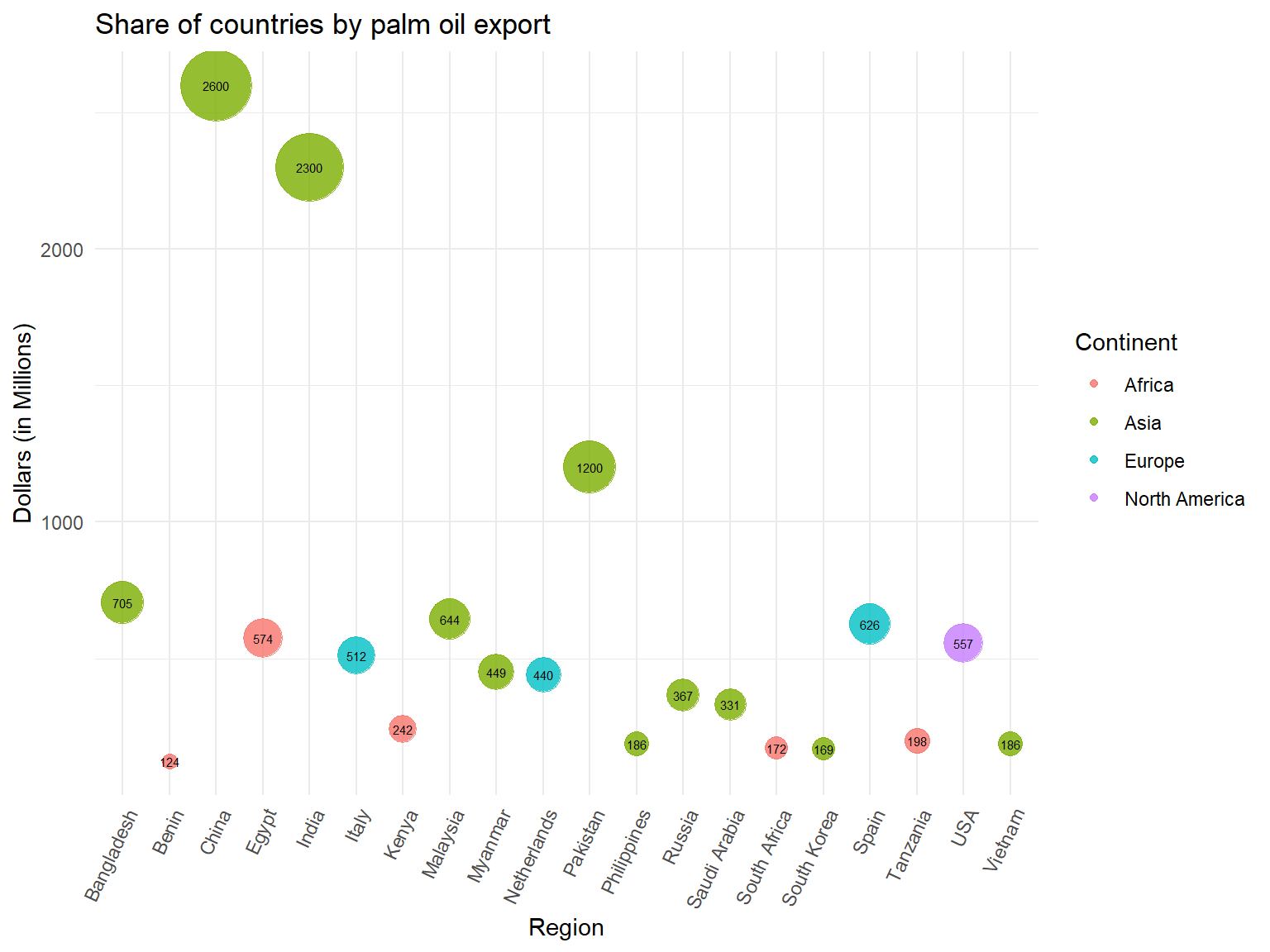
#Plotting Weighted Scatter Graphscatter <-ggplot(data, aes(x = region, y = dollars_millions, size = dollars_millions, color = continent)) +geom_point(alpha =0.8) +scale_size_continuous(range =c(3, 15)) +geom_text(aes(label = dollars_millions), vjust =0.5,hjust =0.5,color ="black",size =2) +theme_minimal() +theme(axis.text.x =element_text(angle =65, hjust =1)) +labs(title ="Share of countries by palm oil export",x ="Region",y ="Dollars (in Millions)",color ="Continent")+guides(size ="none")scatter
world_tbl <-map_data("world") %>%as_tibble()left <-left_join(world_tbl, data, by="region")map1 <-ggplot(left, aes( x = long, y = lat, group=group)) +geom_polygon(aes(fill = dollars_millions), color ="black")+scale_fill_gradient2(low ="white", mid ="yellow", high ="red", midpoint =1500)+labs(title ="Region wise share of palm oil export",x ="Longitude",y ="Latitude",fill ="Million Dollars")ggplotly(map1)